As the single largest element of the interior décor, flooring plays a vital role in the creation of the right environment for a commercial outlet, whether it is an office, hotel, department store, supermarket or restaurant.
In fact, in this intensely competitive day and age, customers will often choose a place over another simply for the ambience and aesthetic appeal and not necessarily the quality of the product or even service – especially for establishments in the hospitality industry.
Even in the office workplace, recent surveys have found that the right lighting, colours and layout of furnishings can greatly boost creativity and productivity in employees.
Thus, to project the right professional image – and to create the best working environment – it is worth investing in quality Commercial Flooring.
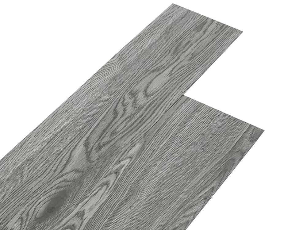
There is a vast amount of choice these days, from Carpet to vinyl, Hardwood to Laminate, marble to tile, with types and styles to suit every budget.
It is also very important to put some effort into the interior decorating, particularly in the choice of colours. This may be limited depending on your choice of flooring type (e.g. marble or hardwood) but with many options (e.g. carpet, vinyl) the choice can be endless.
Old Fashioned
Traditionally, offices in particular were always decorated in muted hues of grey and taupe as these were thought to be sophisticated and least likely to be offensive.
However, it’s now believed that décor like this which lacks colour can be very numbing, leading to a loss in employee productivity – and it certainly isn’t likely to attract customers into a café or shop!
In fact, companies which had dimly lit, grey cubicles were finding it increasingly difficult to attract creative talent.
So now there is a shift away from neutral shades towards more colour, which can be very stimulating to the brain, improving moods and effectiveness.
But choose wisely. The wrong bright colour can be just as bad as a boring neutral shade. In general steer well clear of bright, garish colours and colours that do not occur in nature – such as fluorescent orange or pink – these send jarring signals to the brain, almost like the ear picking up on painful, loud noises.
While it’s important to have a reasonable amount of colour, it should not be too strong and saturated – try to pick shades which are soothing to the eyes. Some good choices are:
BLUE – the most popular colour, according to surveys of employees, blue has a very calming effect on the brain and creates a soothing environment, thus helping to reduce stress.
Probably one reason it is often used in day spas. Popular shades are those which resemble the sea or sky – a grey blue can be too chilling and depressing.
Note, also, that the signals it sends to the brain are the least stimulating and so it may not be the best choice for a creative environment, such as an advertising agency (although this depends partly on the shade of blue).
GREEN – this is another soothing colour, inspiring relaxation, particularly if it emulates shades found in nature, such as grass green or spring green.
ORANGE – this is one colour which can have hugely different effects depending on the shade and tones used.
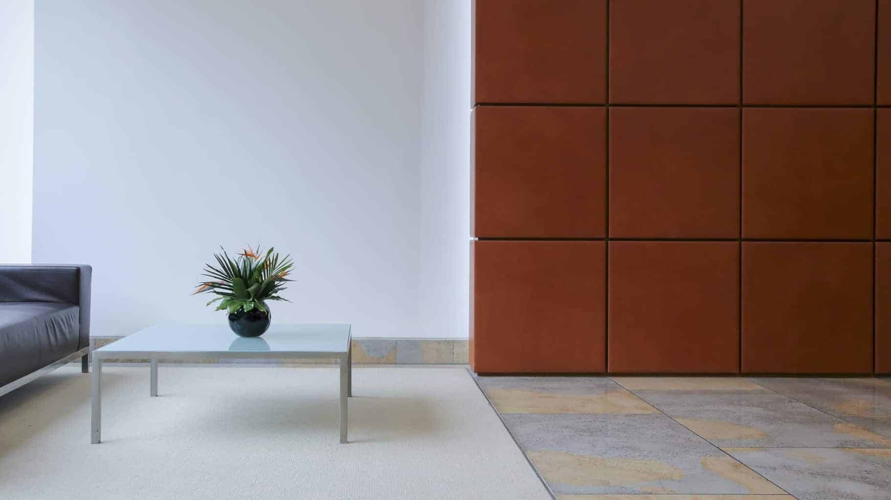
A muted, earthy orange can create a very warm, welcoming environment and can help people to relax and be more creative.
However, get the shade slightly wrong so that it is too loud and strong and it can have a very negative effect, raising tension levels and even causing headaches.
It is a known fact that fast-food outlets often use orange interiors to encourage people to eat quickly and leave.
RED – red was also quite a popular choice in surveys as it is a very stimulating colour, sending the most signals to the brain.
However, for this reason, it can be very distracting and so should be used sparingly, as accent colours in small areas. Similarly with yellow and magenta.
PINK – this is probably one colour to avoid, less you are a baby boutique (and then it’s important to choose the right shade) as it has been found to have a numbing effect on the brain and in fact, a specific shade of pink has been known to be used in police cells and institutions to help calm inmates who are manic or delirious.
In general, people seem most comfortable with pastel shades and colours found in nature, therefore even if you pick a strong colour (e.g. red), opt for tones and hues that are slightly more muted or more “natural”.
And remember, whatever colour you choose, it is important to ensure regular cleaning of your commercial flooring, to maintain a professional image.